


Quick summary
Summarize this blog with AI
A useful Power BI dashboard starts with one reader and one decision. Put the selected period and filters first, the key result and its comparison next, then the chart or table that explains where to act. Choose visuals after defining those questions, and check the numbers before adjusting colors.
If you can clean data and write measures but get stuck on a blank report canvas, this worked example gives you a starting point. You will build a weekly support review with three summary cards, a backlog trend, a team comparison, and a review table. The sample data, measure definitions, expected results, and layout are included.
Here, “dashboard” means an overview used to make a recurring decision. In Power BI, the worked design is an interactive report page; a Power BI service dashboard is a separate surface made from pinned tiles.
Power BI dashboard design checklist
- Write the decision: who opens the page, how often, and what they need to do.
- Define the grain: distinguish activity during a period from a snapshot at its end.
- Choose the essentials: one current condition, one comparison, and one exception worth reviewing.
- Order the page: period and scope, summary, explanation, then action.
- Make selections visible: show the active week and team; provide a way to clear filters.
- Verify the result: test the same tiny dataset in SQL and under several report selections.
- Test a reader task: ask someone to find the issue and explain the next step without a tour.
Follow the example below, then use the downloadable dashboard review checklist on your own page.
Choose one reader and one decision
Start with a sentence that describes the reader, the cadence, and the action:
Every Monday, the support manager needs to identify which team requires a backlog review, so they can investigate aging cases and decide whether work should be reassigned.
This is narrower than “show support performance.” It tells you which comparisons matter, which details belong on the overview, and what a useful next step looks like.
If the request is still unclear, first use the stakeholder scoping workflow. The design work below begins after the decision and metric definitions have been agreed.
A finance director and a support supervisor may use the same data but need different views. Give this first page a specific audience. Add another page only when another decision requires it.
Use a small dataset with an explicit grain
Our fictional input has one row per team per reporting week. opened and closed count tickets during that week. ending_backlog is a snapshot at the end of the week. oldest_open_days is the age, in whole calendar days, of the oldest ticket still open at that snapshot.
Weeks start on Monday. Assume consistent reporting time zones, no transfers between teams in this teaching fixture, and complete source data for all six rows. The manager's agreed review threshold is an oldest open ticket above ten days; that is an example business rule, not an industry standard.
Download the six-row support backlog CSV, or copy the data below. It contains fictional data and no customer records.
Use this fictional fixture for public practice. Keep private business data inside your approved Power BI and SQL environments, and exclude credentials or connection strings from shared queries.
week_start,team,opened,closed,ending_backlog,oldest_open_days
2026-09-07,North,80,75,25,8
2026-09-07,South,100,95,35,9
2026-09-14,North,90,95,20,6
2026-09-14,South,110,90,55,12
2026-09-21,North,85,90,15,5
2026-09-21,South,120,90,85,16
This grain changes how you aggregate. For one week, you can sum backlog across teams. Across multiple weeks, use a trend of snapshots rather than adding snapshots together. For oldest ticket age, use the maximum across teams, not the sum.
Missing team-week rows are unknown until source completeness is checked. A zero-backlog row is a measured result. Those states need different labels and behavior.
Give every metric a job
Before adding a visual, write the question it answers and what a different answer would change. A metric without a role can wait.
| Question | Metric | Role on the page |
|---|---|---|
| How large is the queue? | Ending backlog for the selected week | Top summary card |
| Is the queue growing? | Change from the previous complete week | Comparison beside the backlog card |
| Where should we investigate? | Backlog and backlog change by team | Ranked team comparison |
| Is aging becoming a problem? | Oldest open ticket age by team | Summary and review table |
| What might explain the change? | Opened versus closed tickets | Supporting diagnostic view |
Keep handling-time distributions, staffing schedules, customer satisfaction, and channel mix off this overview unless they support its decision. They may belong on a diagnostic page. Their absence also limits what you can conclude: ticket counts alone cannot establish that a team is understaffed.
There is no universal correct number of KPIs. A small shortlist is a useful starting point, then a reader task should determine whether another measure earns space.
Sketch the reading order before formatting
For this example, the reader needs the reporting period, the current condition, the location of the problem, and the next review action. Use those needs to order the page.
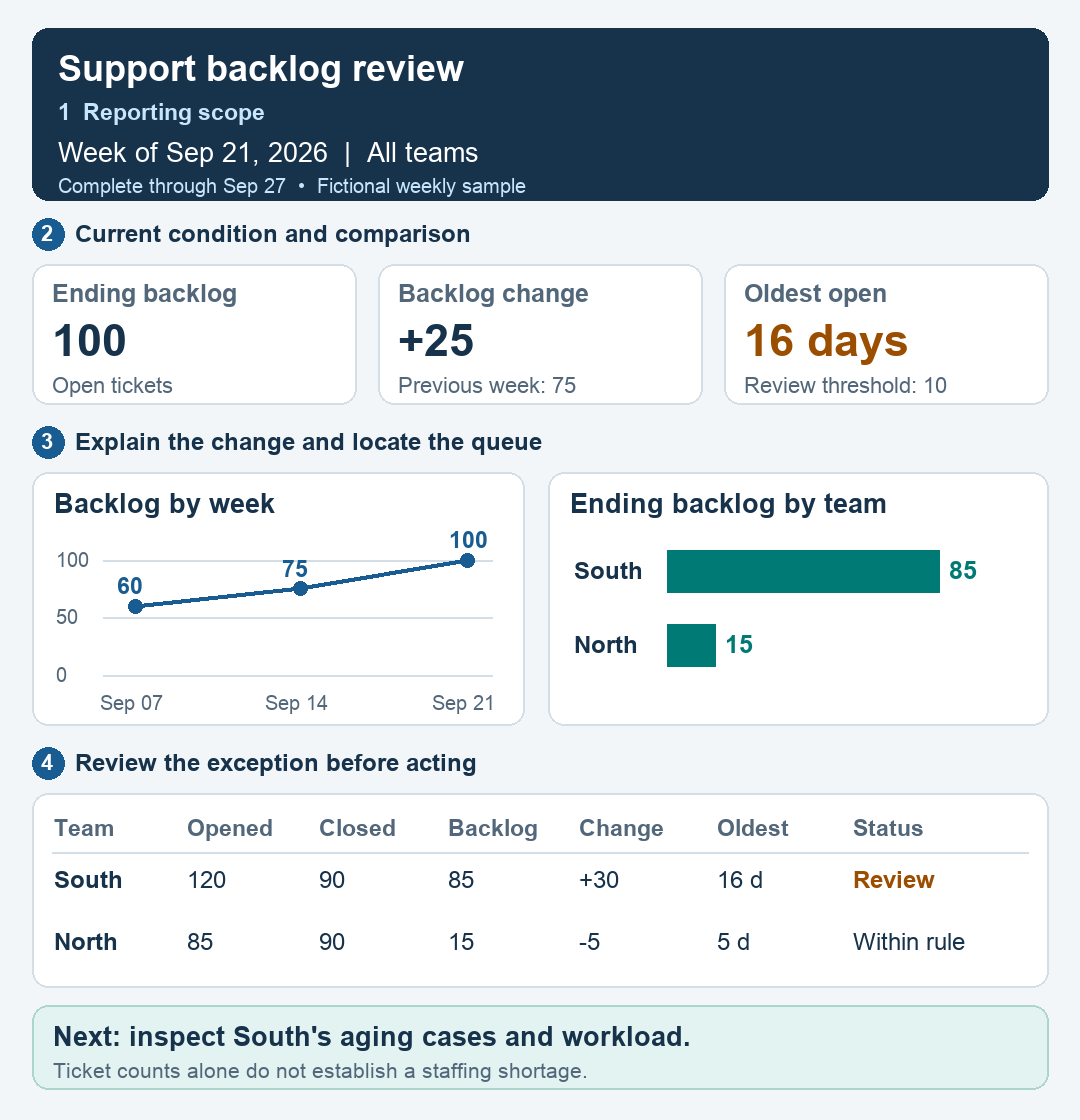
- Scope: the week, selected teams, and data-through date tell the reader what the page represents.
- Condition: backlog is 100, up 25 from 75; the oldest ticket is 16 days against the agreed ten-day threshold.
- Explanation: the trend establishes context, while the team bars locate the queue.
- Action: South grew by 30 while North fell by five. Review South's aging cases before deciding how to respond.
The example is a reading plan, not a required pixel arrangement. A wider screen can put the trend beside the team comparison; a narrow layout can stack them in the same reading order.
Leave space between sections. Group related elements, align their edges, and use the same formatting for the same meaning. A chart should gain attention because it contains the answer, rather than because it has the strongest shadow.
| Common first draft | Worked layout | Why it helps |
|---|---|---|
| Six equally prominent cards | Three cards tied to queue size, change, and aging | The reader can distinguish the main issue from supporting detail. |
| A large share-of-backlog pie | Ranked team bars and an exact-value table | The reader can compare teams and see their contributions to the change. |
| Filters hidden in a pane | Visible week and team selectors | The reader knows which population the numbers describe. |
| A warning conveyed only in red | Ticket age, the threshold, and a written review status | The rule remains understandable without color perception or hovering. |
Choose chart types from the comparison
Use a line chart for backlog over time. Each point is the total snapshot for one complete week: 60, 75, and 100. Three points can show the fixture's direction, but are too little evidence to call the change a lasting trend.
Use a horizontal bar chart for the team comparison. Sort by ending backlog, with a stable team-name tie-breaker. The bars make South's 85 versus North's 15 easy to compare. A pie chart adds little when the manager needs to find the larger queue and its change.
Use a table when exact values and several measures must be read together. The review table connects queue size, change, and ticket age. In a real operational report, a separate detail page can list the eligible cases with their owner, priority, and age. This aggregate fixture supports choosing a team to review; it does not identify individual tickets.
Prefer clear titles such as “Ending backlog by team” over titles that merely name fields. Include units and explain whether a lower or higher value is favorable when that would otherwise be ambiguous.
Build the worked layout in Power BI
Import the CSV into Power BI Desktop and name the table WeeklyQueues. Set week_start to Date, team to Text, and the four numeric columns to Whole number. The example deliberately uses a small flat table to isolate page design; a larger warehouse model should use the appropriate date and team dimensions.
Create a reporting-week selector
Create this calculated table, then place its week_start column in a single-select slicer:
ReportWeek =
DISTINCT ( WeeklyQueues[week_start] )
Keep ReportWeek disconnected from WeeklyQueues; remove any automatically created relationship between them. Select September 21, 2026 for this demonstration. A disconnected selector lets the measures choose the snapshot week without removing historical weeks from the trend's axis. In a live report, the default should follow a verified complete-period rule rather than the latest date found in an incomplete extract.
Create the snapshot and comparison measures
Create each definition below as a separate measure. The selected week determines the snapshot; team filters remain in effect.
Selected Reporting Week =
SELECTEDVALUE ( ReportWeek[week_start] )

Ending Backlog =
VAR ReportingWeek = [Selected Reporting Week]
RETURN
    IF (
        ISBLANK ( ReportingWeek ),
        BLANK(),
        CALCULATE (
            SUM ( WeeklyQueues[ending_backlog] ),
            REMOVEFILTERS ( WeeklyQueues[week_start] ),
            WeeklyQueues[week_start] = ReportingWeek
        )
    )

Previous Backlog =
VAR ReportingWeek = [Selected Reporting Week]
VAR CurrentTeams =
    CALCULATETABLE (
        VALUES ( WeeklyQueues[team] ),
        REMOVEFILTERS ( WeeklyQueues[week_start] ),
        WeeklyQueues[week_start] = ReportingWeek
    )
VAR PreviousTeams =
    CALCULATETABLE (
        VALUES ( WeeklyQueues[team] ),
        REMOVEFILTERS ( WeeklyQueues[week_start] ),
        WeeklyQueues[week_start] = ReportingWeek - 7
    )
RETURN
    IF (
        ISBLANK ( ReportingWeek )
            || ISEMPTY ( CurrentTeams )
            || COUNTROWS ( EXCEPT ( CurrentTeams, PreviousTeams ) ) > 0,
        BLANK(),
        CALCULATE (
            SUM ( WeeklyQueues[ending_backlog] ),
            REMOVEFILTERS ( WeeklyQueues[week_start] ),
            WeeklyQueues[week_start] = ReportingWeek - 7,
            KEEPFILTERS ( CurrentTeams )
        )
    )

Backlog Change =
VAR CurrentBacklog = [Ending Backlog]
VAR PriorBacklog = [Previous Backlog]
RETURN
    IF (
        ISBLANK ( CurrentBacklog ) || ISBLANK ( PriorBacklog ),
        BLANK(),
        CurrentBacklog - PriorBacklog
    )

Oldest Open Days =
VAR ReportingWeek = [Selected Reporting Week]
RETURN
    IF (
        ISBLANK ( ReportingWeek ),
        BLANK(),
        CALCULATE (
            MAX ( WeeklyQueues[oldest_open_days] ),
            REMOVEFILTERS ( WeeklyQueues[week_start] ),
            WeeklyQueues[week_start] = ReportingWeek
        )
    )
The previous-week measure withholds the comparison if a currently selected team lacks a prior snapshot. It does not prove source completeness: a team missing from the current extract needs an expected-team roster or a source completeness check. Validate team-week uniqueness before using these measures.
For the two activity measures, use the same selected-week filter:
Opened Tickets =
VAR ReportingWeek = [Selected Reporting Week]
RETURN
    IF (
        ISBLANK ( ReportingWeek ), BLANK(),
        CALCULATE (
            SUM ( WeeklyQueues[opened] ),
            REMOVEFILTERS ( WeeklyQueues[week_start] ),
            WeeklyQueues[week_start] = ReportingWeek
        )
    )

Closed Tickets =
VAR ReportingWeek = [Selected Reporting Week]
RETURN
    IF (
        ISBLANK ( ReportingWeek ), BLANK(),
        CALCULATE (
            SUM ( WeeklyQueues[closed] ),
            REMOVEFILTERS ( WeeklyQueues[week_start] ),
            WeeklyQueues[week_start] = ReportingWeek
        )
    )
Keep the trend and review status consistent
Backlog Trend =
VAR ReportingWeek = [Selected Reporting Week]
VAR AxisWeek = SELECTEDVALUE ( WeeklyQueues[week_start] )
RETURN
    IF (
        NOT ISBLANK ( ReportingWeek )
            && NOT ISBLANK ( AxisWeek )
            && AxisWeek <= ReportingWeek
            && AxisWeek >= ReportingWeek - 14,
        SUM ( WeeklyQueues[ending_backlog] ),
        BLANK()
    )

Review Status =
VAR Backlog = [Ending Backlog]
VAR TicketAge = [Oldest Open Days]
RETURN
    SWITCH (
        TRUE(),
        ISBLANK ( Backlog ), "Unavailable",
        Backlog = 0, "No open tickets",
        ISBLANK ( TicketAge ), "Unavailable",
        TicketAge > 10, "Review",
        "Within threshold"
    )
For this weekly fixture, the trend includes the selected week and the two preceding weeks. The ten-day review threshold remains an example business rule. A measured backlog of zero produces “No open tickets,” including when ticket age is blank; a missing backlog remains unavailable.
| Visual | Fields or measures | Setting to check |
|---|---|---|
| Reporting-week slicer | ReportWeek[week_start] | Single selection; September 21 for the fixture |
| Team slicer | WeeklyQueues[team] | Show the selection and allow it to be cleared |
| Three cards | Ending Backlog; Backlog Change; Oldest Open Days | Whole-number units; signed change; visible comparison and age threshold |
| Line chart | WeeklyQueues[week_start] on the axis; Backlog Trend as the value | Use the date column itself rather than an automatic date hierarchy |
| Horizontal bar chart | WeeklyQueues[team]; Ending Backlog | Descending backlog; stable tie-breaking by team |
| Review table | Team; Opened Tickets; Closed Tickets; Ending Backlog; Backlog Change; Oldest Open Days; Review Status | Sort by backlog and retain exact values |
Use Edit interactions to decide whether a team-bar selection filters the review table and cards. For this page, let team selections filter the related visuals consistently. Make the selected team visible and confirm that clearing it restores the all-team result. Microsoft's visual interaction documentation explains how to configure that behavior.
Download the complete dashboard measure definitions. These definitions accompany the CSV; they do not include a saved Power BI report file.
Validate the numbers before polishing
The following query is self-contained PostgreSQL SQL. It reproduces the current-week team table and compares each team with the exact previous week. A missing previous row yields an unknown change rather than an invented zero.
WITH weekly_queues (
    week_start, team, opened, closed,
    ending_backlog, oldest_open_days
) AS (
    VALUES
        (DATE '2026-09-07', 'North', 80, 75, 25, 8),
        (DATE '2026-09-07', 'South', 100, 95, 35, 9),
        (DATE '2026-09-14', 'North', 90, 95, 20, 6),
        (DATE '2026-09-14', 'South', 110, 90, 55, 12),
        (DATE '2026-09-21', 'North', 85, 90, 15, 5),
        (DATE '2026-09-21', 'South', 120, 90, 85, 16)
)
SELECT
    current_week.team,
    current_week.opened,
    current_week.closed,
    current_week.ending_backlog,
    current_week.ending_backlog
        - previous_week.ending_backlog AS backlog_change,
    current_week.oldest_open_days
FROM weekly_queues AS current_week
LEFT JOIN weekly_queues AS previous_week
    ON previous_week.team = current_week.team
   AND previous_week.week_start = current_week.week_start - 7
WHERE current_week.week_start = DATE '2026-09-21'
ORDER BY current_week.ending_backlog DESC, current_week.team;
team | opened | closed | ending_backlog | backlog_change | oldest_open_days
South | 120 | 90 | 85 | 30 | 16
North | 85 | 90 | 15 | -5 | 5The overview should therefore show 205 opened, 180 closed, 100 ending backlog, a backlog increase of 25, and an oldest open ticket of 16 days. The previous week's backlog is 75. The increase is 33.3% if you choose to show a percentage comparison.
Check the uniqueness of team-week keys before using a self-join on real data. Duplicate snapshots can multiply rows. Check that all expected teams are present before marking the week complete. In a live process, transfers, reopened tickets, and corrections can also affect the reconciliation between opening backlog, arrivals, closures, and ending backlog.
For a reusable way to express these expectations, see testing SQL queries with expected results.
| Selected week and team | Backlog | Previous backlog | Change | Oldest ticket |
|---|---|---|---|---|
| September 21, all teams | 100 | 75 | +25 | 16 days |
| September 21, South | 85 | 55 | +30 | 16 days |
| September 21, North | 15 | 20 | −5 | 5 days |
| September 14, all teams | 75 | 60 | +15 | 12 days |
| September 7, all teams | 60 | Unavailable | Unavailable | 9 days |
For a missing-data check, remove South's September 14 row from a separate copy. South's September 21 backlog remains 85, but its previous value and change should be blank. The all-team comparison should also be withheld, rather than comparing 100 with North's partial previous backlog of 20.
The measure expressions were checked in the anonymous DAX.do engine against the five selections above, all three trend points, no selected week, and a missing prior snapshot. The SQL query provides an independent check of the fixture's aggregates. The layout illustration represents the example's values; it is not evidence of a Power BI Desktop interface test.
Make filter behavior visible
Use one reporting-week selector for the snapshot summary. Default it to the latest complete week. If a user selects a team, update the cards and comparisons consistently, and label the active team selection beside the period.
The trend can retain the recent history ending at the selected week. Make that rule explicit. A date selection that silently removes the previous week can make a comparison disappear; calculate the comparison from the intended period and show “Previous week unavailable” when its input is missing.
Choose whether clicking a team bar should filter the review table, highlight other visuals, or do nothing. Test that behavior rather than accepting every default interaction. Always offer an obvious way to clear a selection.
Do not label a filtered view “All teams.” Do not present a partial week as a full-week performance drop. Show the data-through date and freshness state, especially when a report is opened before its source has finished loading.
Design empty and incomplete states
A polished page should still make sense when the happy path fails:
- No matching data: state that no rows match the current filters and provide a reset action.
- Incomplete source: show which period or team is missing and withhold the complete-period comparison.
- Late refresh: keep the last verified result clearly dated, or show an unavailable state according to the agreed reporting policy.
- Zero activity: display a measured zero. For an oldest-ticket metric with no open tickets, use “No open tickets,” not an ambiguous age of zero.
These states prevent a loading delay or missing extract from looking like a business improvement. A tooltip alone is too easy to miss for an important qualification.
Test the page with a reader task
Give a reader the page without explaining its layout. Ask them to identify the reporting week, decide which team to review, and say what they would check next. Record where they hesitate and which labels they misunderstand.
For this fixture, a reasonable response is: “The queue increased by 25 this week. South contributed an increase of 30, while North fell by five. South's oldest ticket is 16 days against the ten-day review threshold. I would inspect South's aging cases and workload before changing staffing.”
If the reader notices only the largest number, add comparison context. If they cannot tell what is selected, improve the filter label. If they recommend staffing changes as proven fact, make the limits of the measures clearer.
Test keyboard navigation, readable labels, sufficient contrast, and the narrow layout. Pair color with words or symbols, add useful alt text, and keep essential information visible without hovering. Microsoft's report accessibility guidance explains Power BI's configuration options. Use its mobile report guidance when designing for phone consumption.
FAQ
What is the difference between a Power BI dashboard and a report?
A Power BI service dashboard combines pinned tiles on a dashboard surface. A report contains pages and interactive visuals based on a semantic model. This example designs a report page, which can later contribute tiles to a service dashboard.
How many charts should my first dashboard have?
Use enough to answer the agreed decision and its immediate follow-up questions. In this example, summary cards, one trend, one team comparison, and a review table are sufficient. Remove a visual if the reader cannot explain what it helps them decide.
Should I copy an impressive dashboard template?
You can borrow spacing, alignment, and navigation ideas. Keep your own metric definitions and decision sequence. A template built for another audience may give the wrong information the most prominent space.
What if stakeholders want every metric on one page?
Walk through an actual task together. Put the measures required for that task on the overview, then offer a detail page for investigation. Use the task result to discuss what belongs on the first screen.
How do I explain this work in an interview?
Describe the reader's decision, the data grain, the comparison logic, and one design choice you changed after testing. Show that you validated the numbers and understood their limits. The Power BI practice project covers the model and measure layer behind a report.


